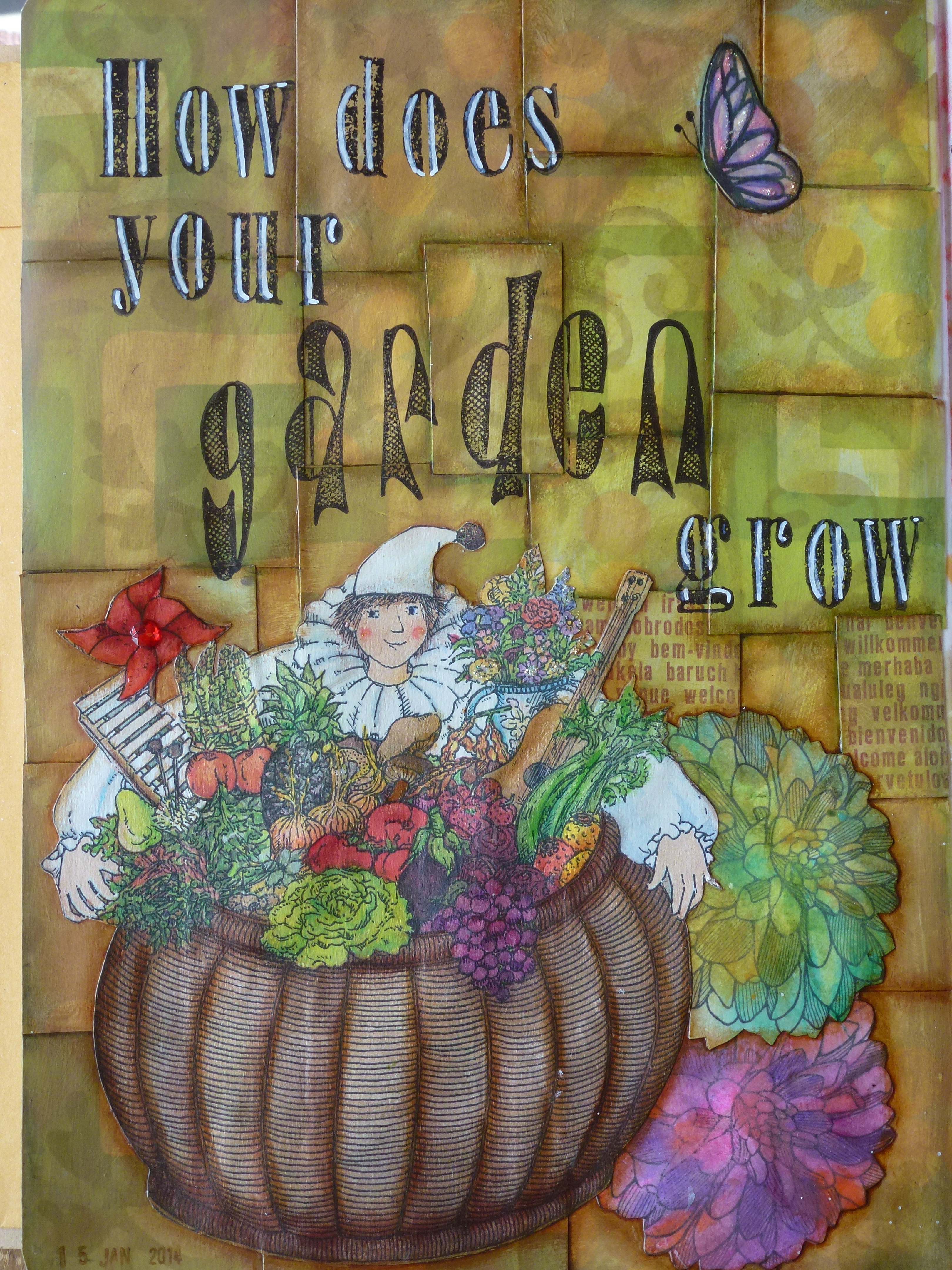


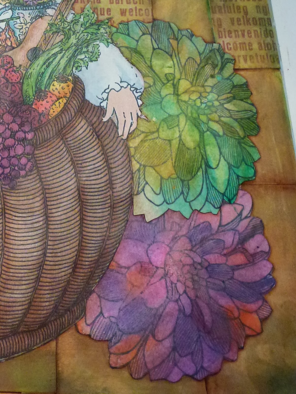
I’ve been dreaming a lot lately of moving to France. I guess that explains this spread in my art journal…


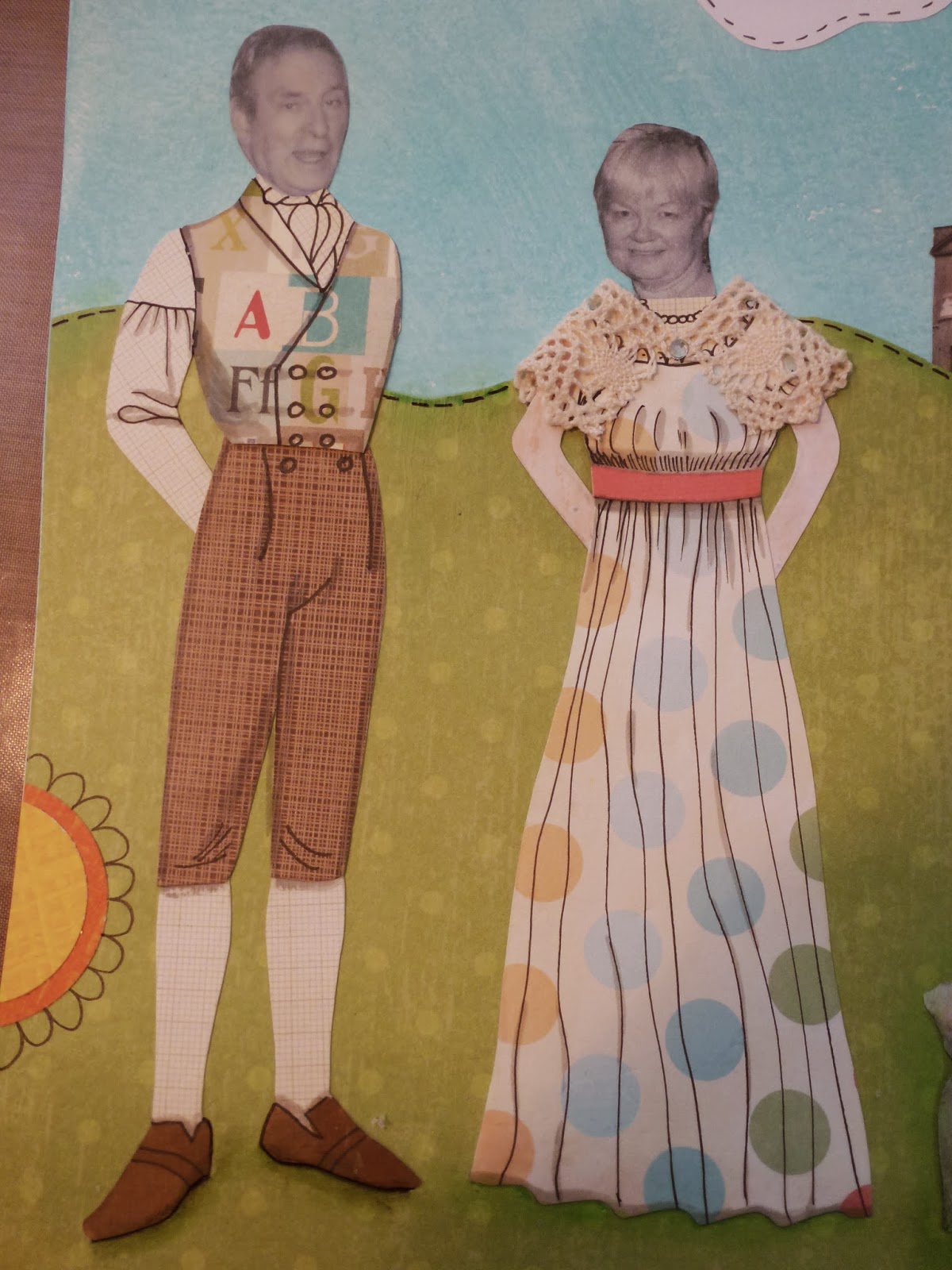
Uncle Peter celebrated turning 80 years young on Monday. I started out making him a card and ended up channeling Mr. Darcy and was inspired to include Auntie Marion and Charlie in the piece. This is how it turned out:


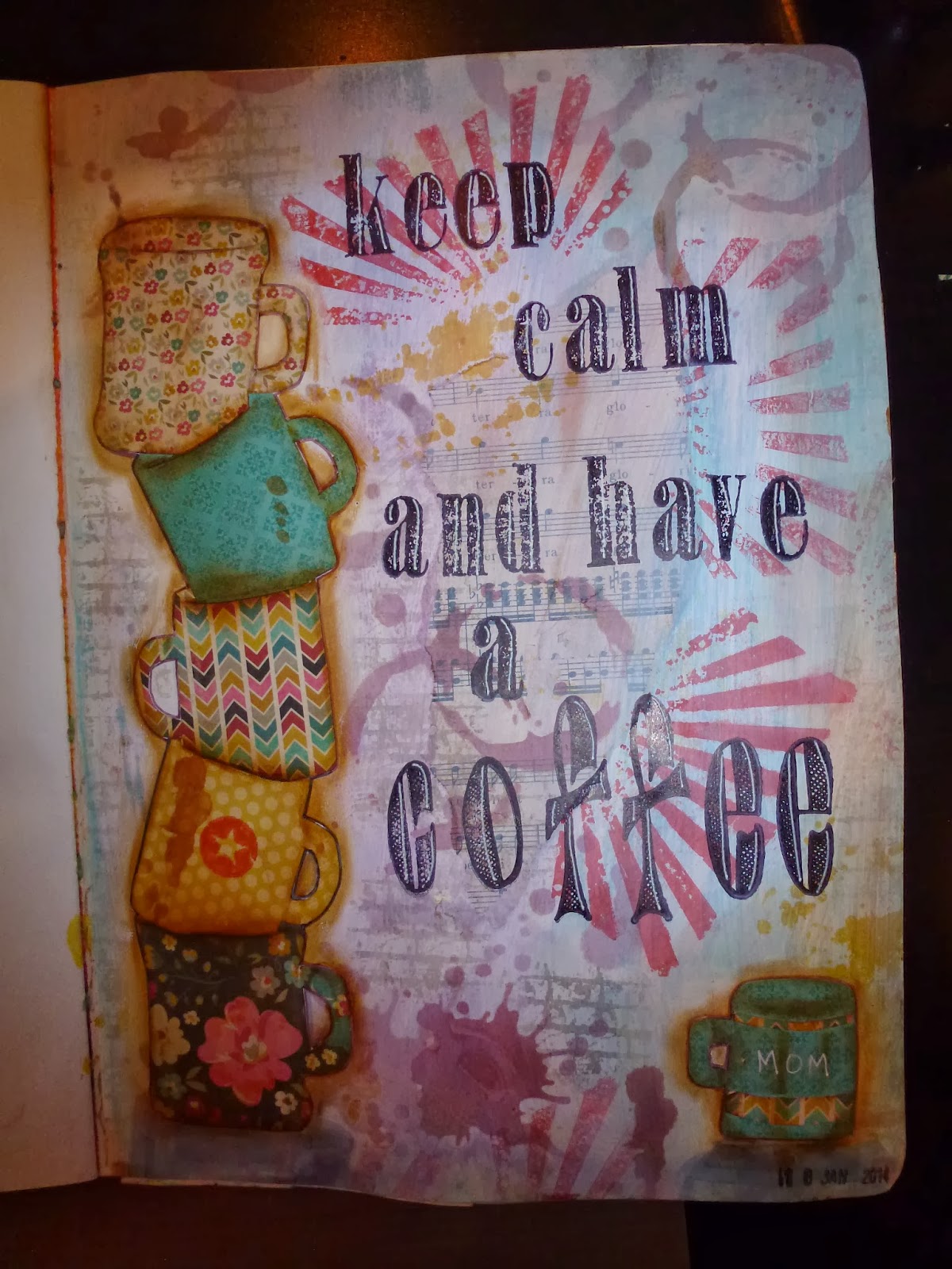

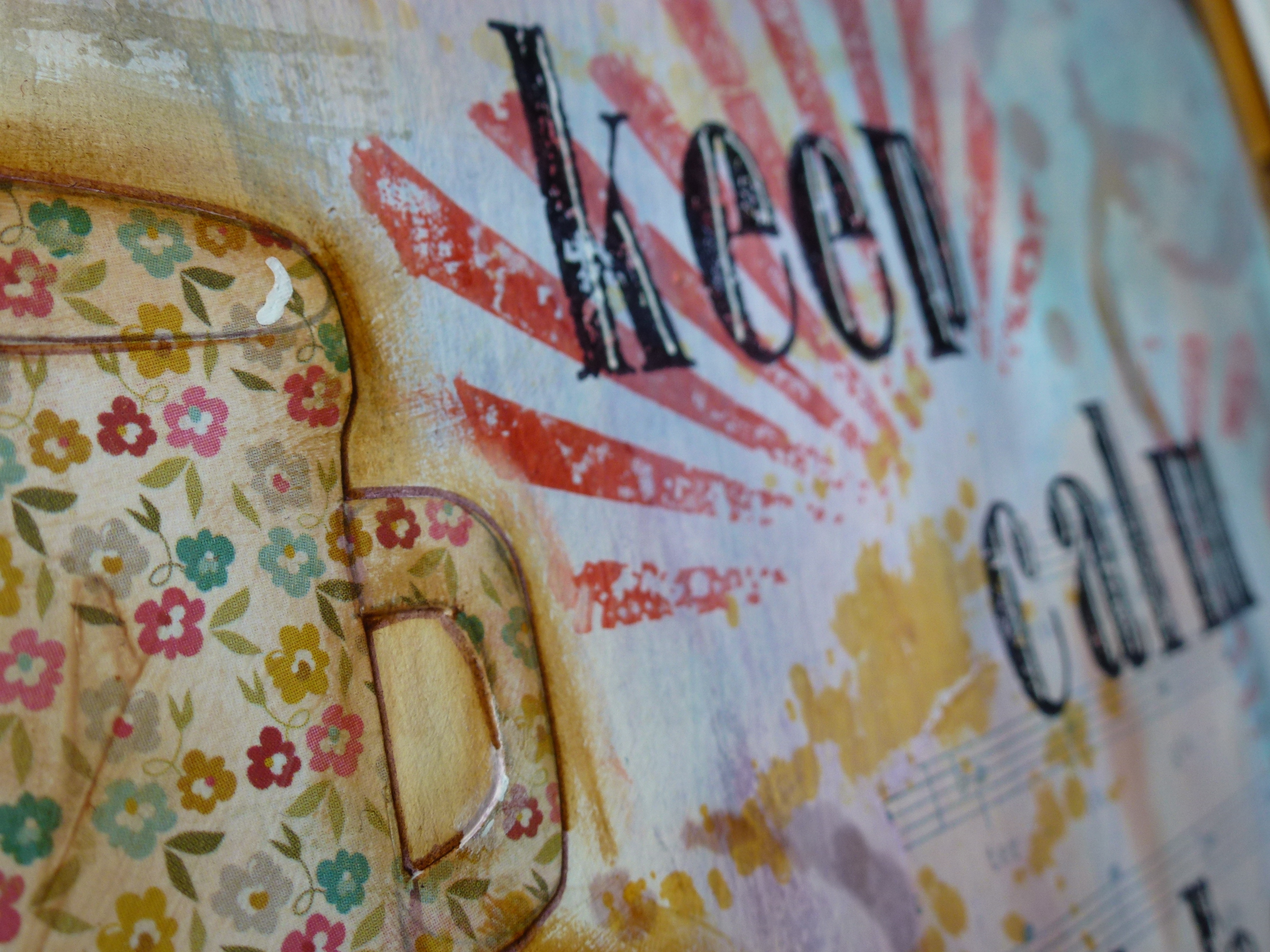


That background isn’t sheet music (although I’d have used that if I’d had any) but a roll of paper by Tim Holtz. It dispenses like plastic wrap. A weird combination of art and utility. Neat!

I’ve been rediscovering my artistic side of late. I have several different types of journals/books/sketchpads. This new one from Ranger Ink’s Dylusions line is a new favourite. The pages are thick, like bristol board, and the elastic holds the covers closed as the pages get thick with art.
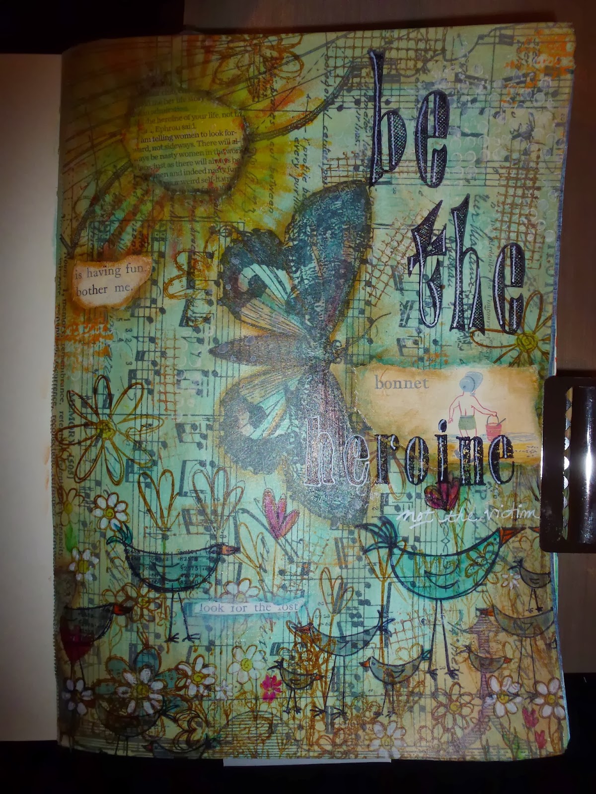
I have a number of old children’s books that I like to cut up for cards and paper crafts. This image kept calling to me, so I used matte medium to make a textured “field” background.

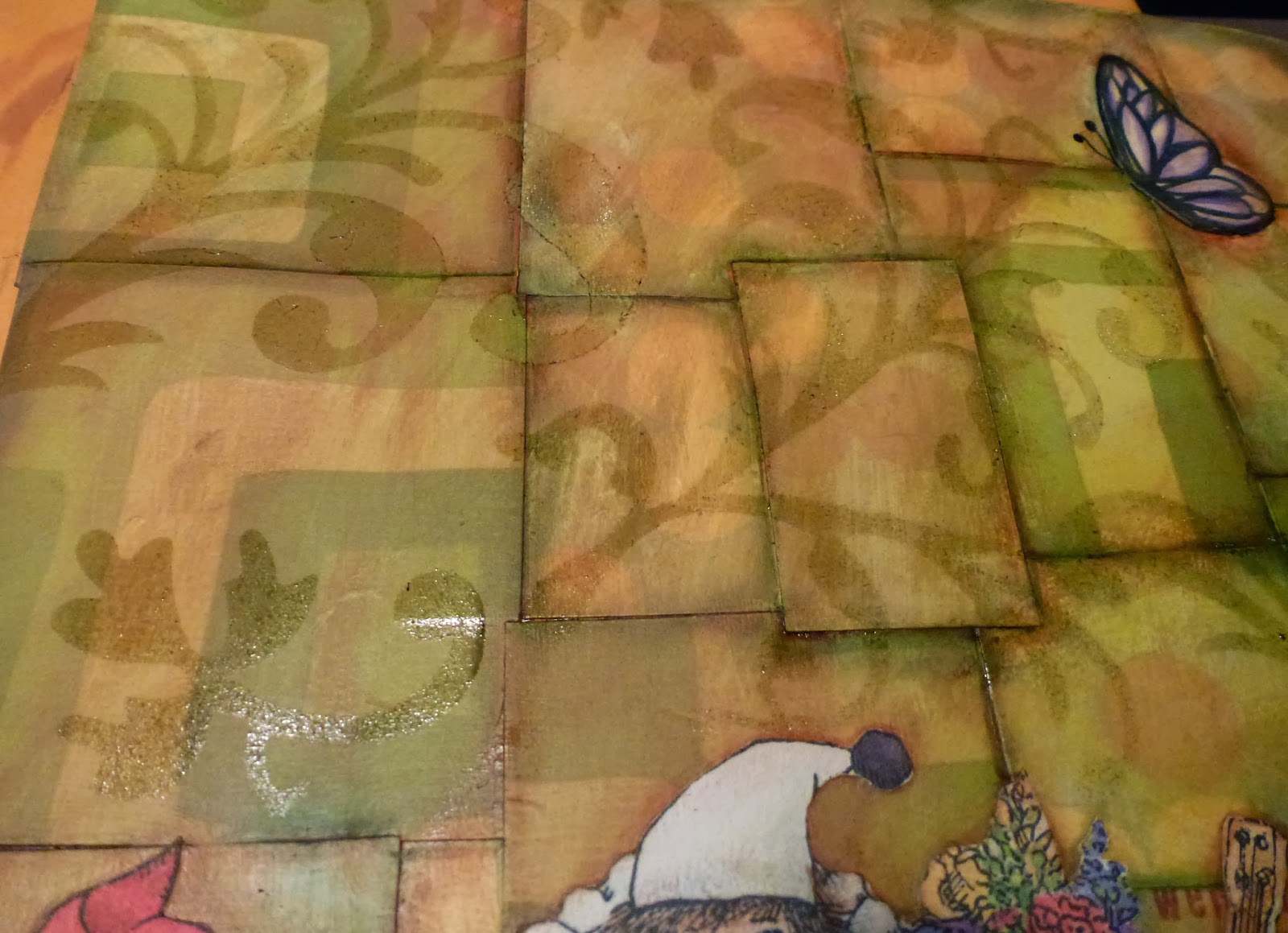
And below it’s dry and has a more muted effect.

I’m still trying to decide if I should add any text. Got any good ideas for me?