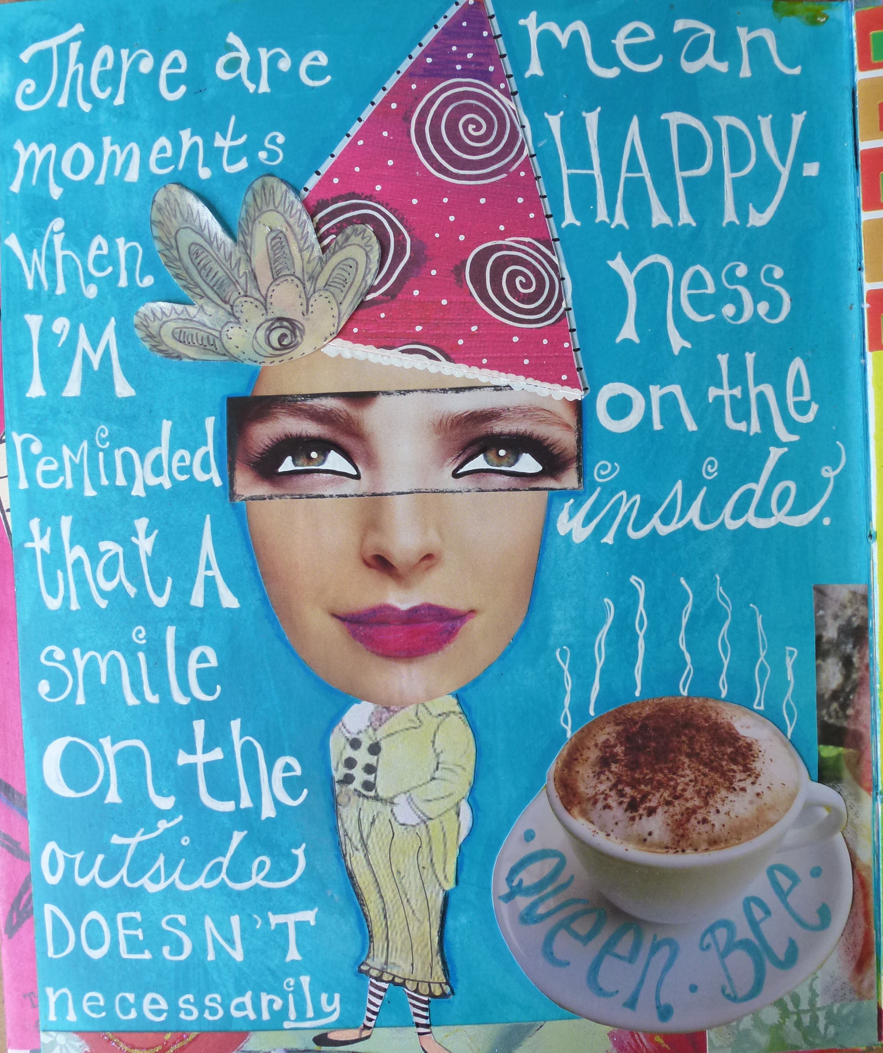
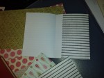
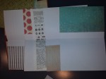
When I first heard of making your own journal my first thought was, why would anyone do that when there are soooo many to choose from at the art store? Well, I’m now a convert. The luxury of being able to choose your own paper is so fantastic! Maybe I’ve just had one too many spray inks soak through the paper and ruin a piece of my artwork on the other side, but I love that I can buy my favourite paper, cut the paper as required and have a custom journal to work in.
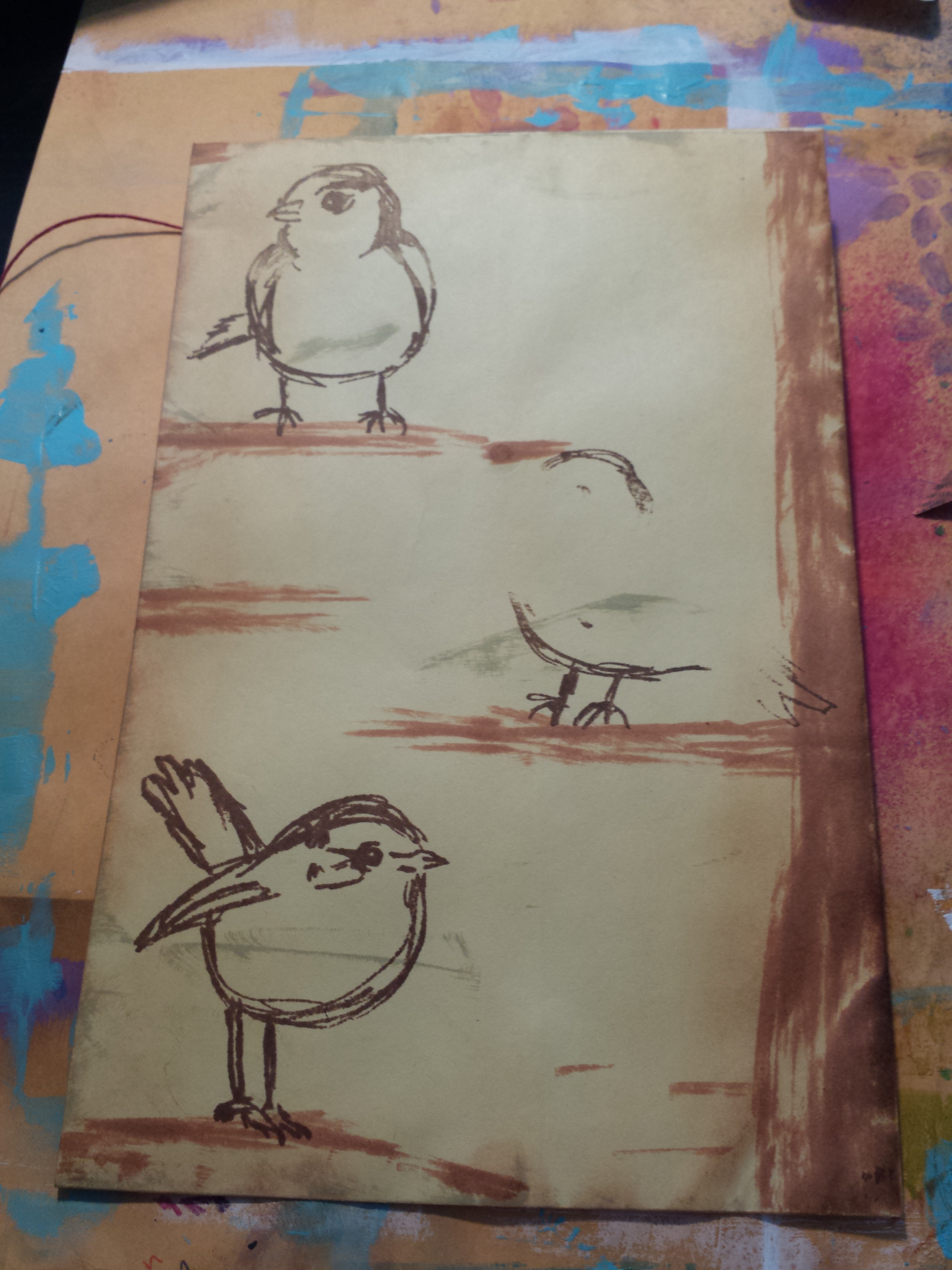
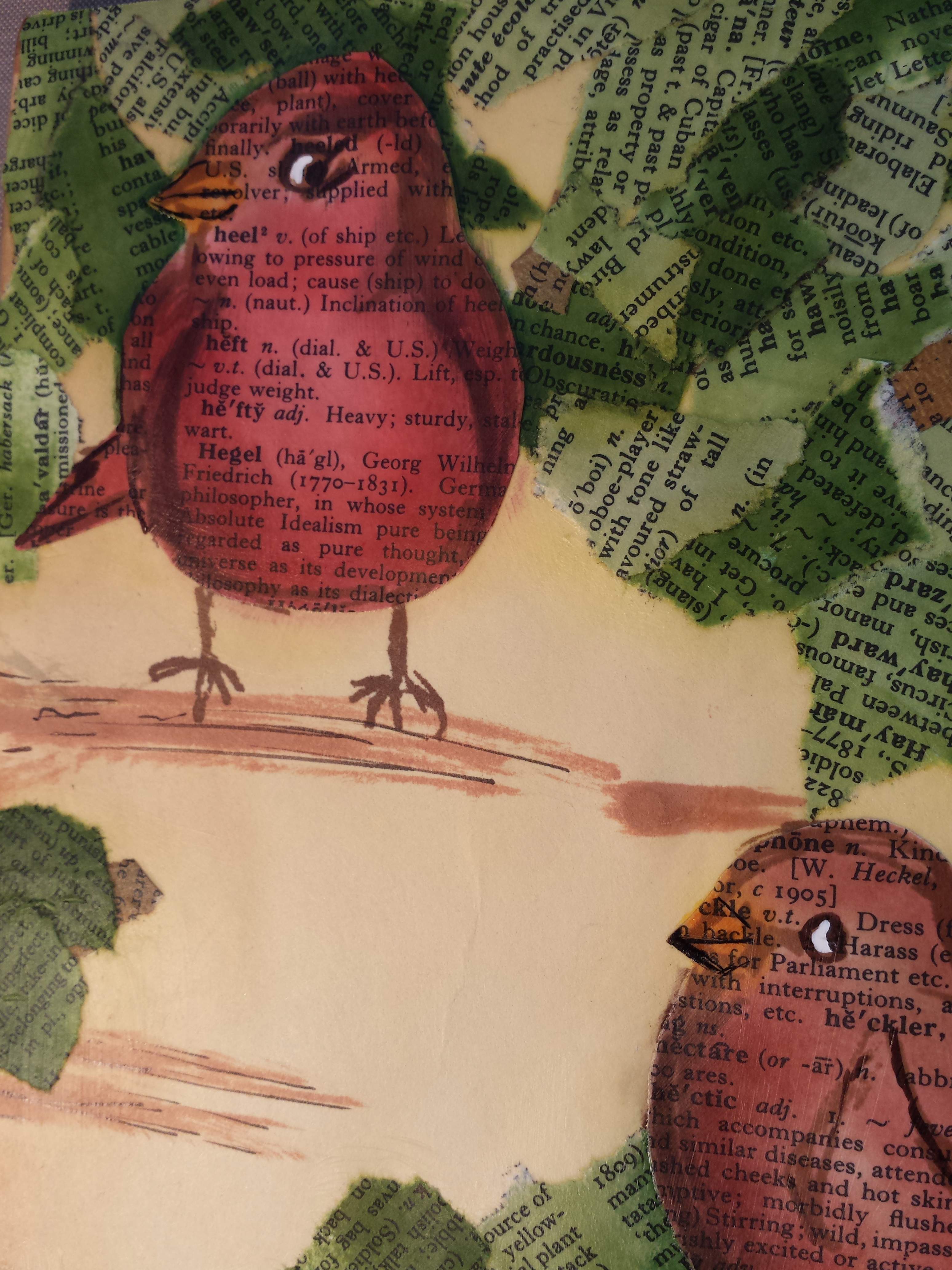
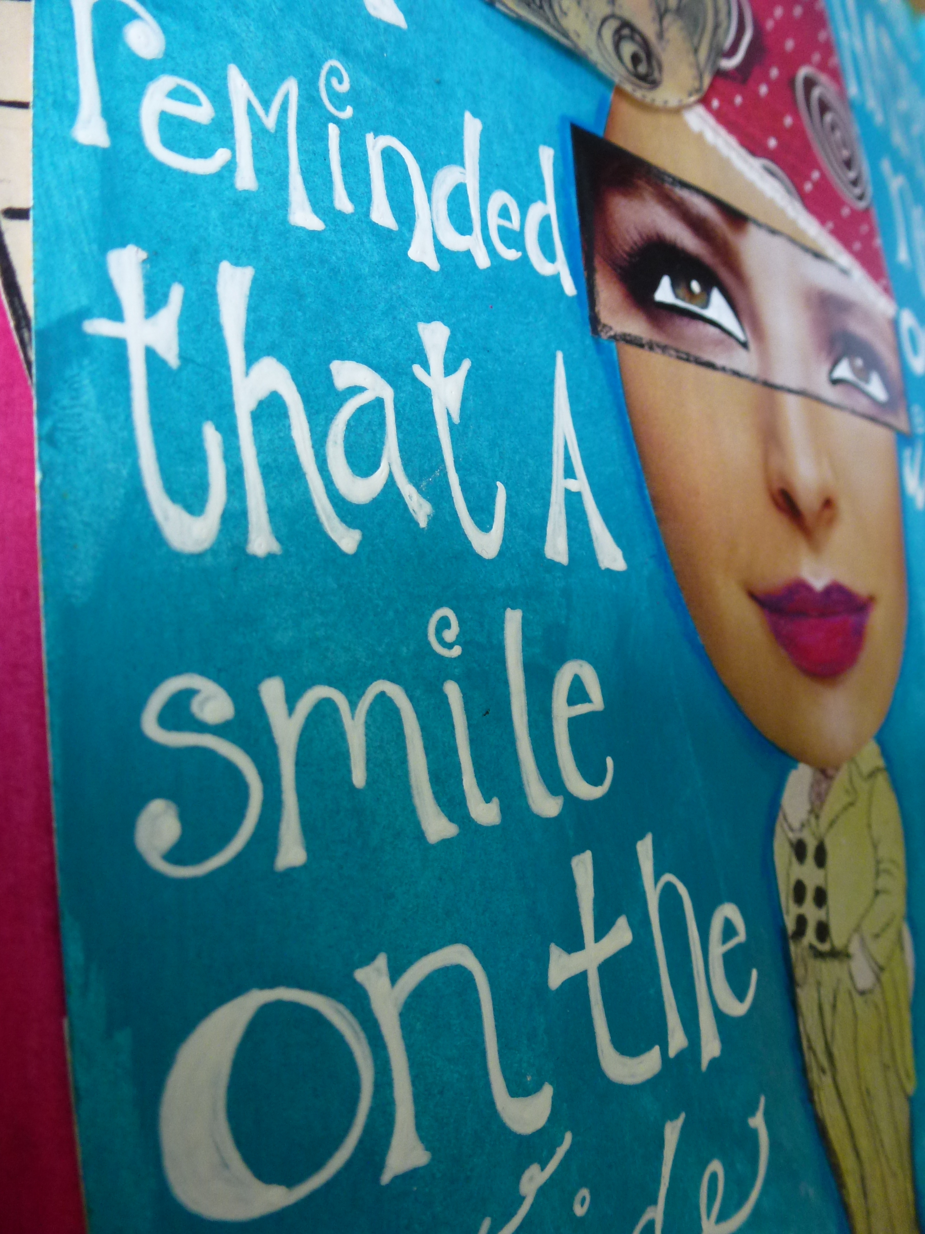
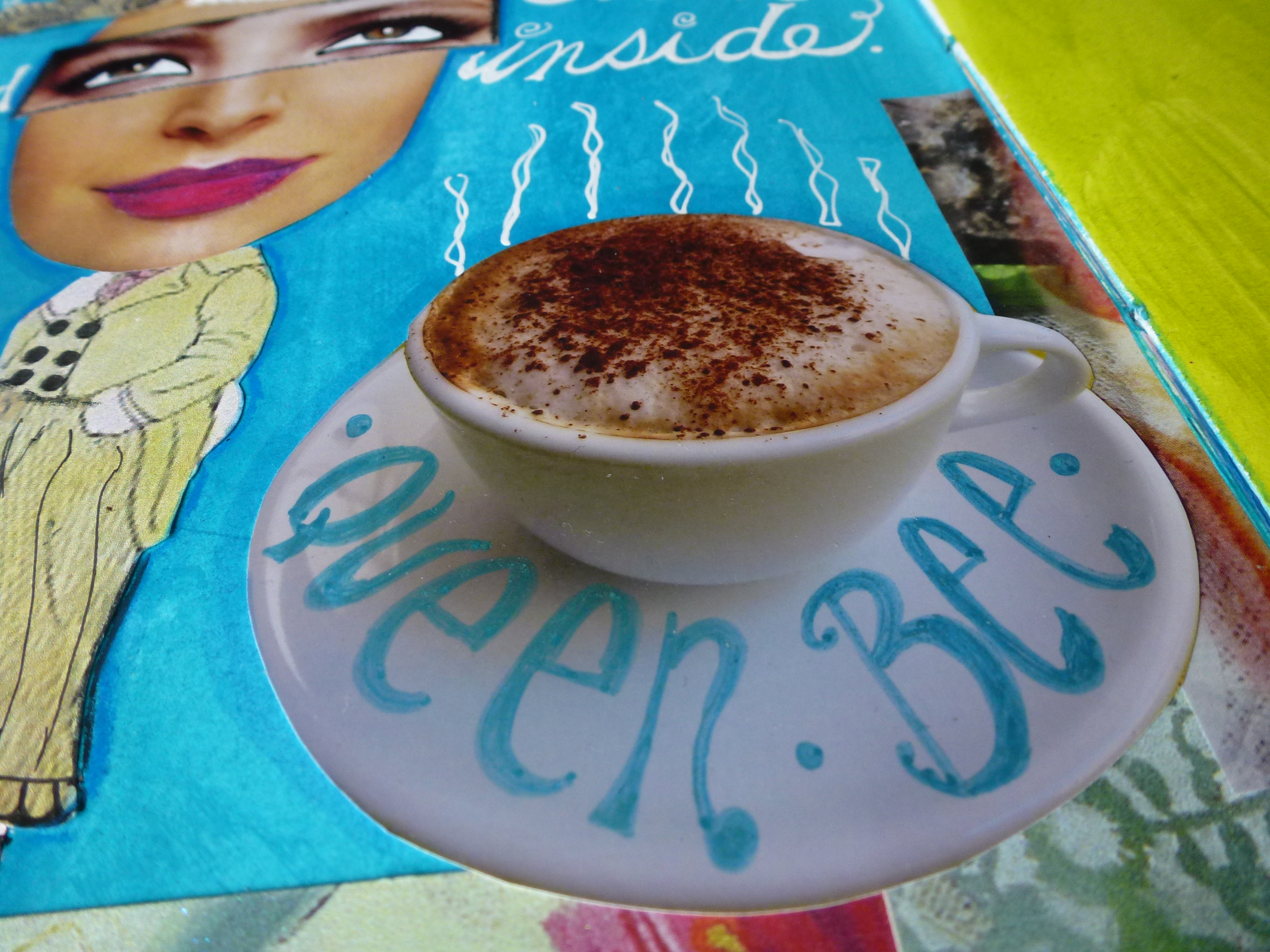
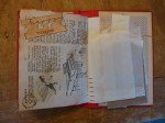
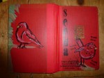
Here are some of my handmade art journals (still working on the art inside!):
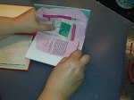
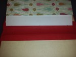
Then I took it a step further and made a bound book using a vintage book cover – not nearly as difficult as I thought it’d be, thanks to a handy little discovery known as gaffer tape.
Front cover.
Here’s how I did it… (Click on the first pic for a gallery to appear.)
Pick your paper. For this journal I used 12×12 scrapbook paper.
Cut paper in 4 x 12 lengths.
Fold paper at the 4.5 and 9 inch marks.
Organize into two signatures (2 nests of paper). One signature is pictured here.
Gently remove book pages from cover and reinforce spine with gaffer tape. (Inside cover.)
(Outside cover.)
Bundle one signature together. Use an awl to poke 3 holes.
Sew the papers together and repeat for the 2nd signature using a tapestry needle and book binding thread or dental floss.
Poke holes in spine that line up with holes in signatures.
Sew signatures to spine.
I added a tag before I tied off the string.
Here’s what it looks like on the outside with one signature sewn in.
And with the second signature sewn.
Isn’t that cool?!
Embellish away! Here’s the inside front cover.
I added a ‘pocket.’
Used a vintage dictionary page. (Those are extra ‘pockets’ on the right to add in as needed.)
More stamping.
Even used deli paper as a page.
On the left is a Trader Joe’s chocolate bar wrapper I thought was cute.
Full cover.
Front cover.
I plan on uploading a video tutorial soon. It may be a little easier to see this in action! I’d LOVE to see a handmade journal you’ve created!
At the end of a family dinner a while ago we got to talking about old photos. Out came the envelopes and boxes of faded photographs, followed by screams of delight at seeing family members locked in a time warp of different hairstyles, fashions and locations. (The first pic features my dear mother-in-law… what a cutie!)
I’ve been having some fun scanning them in and adding sayings that I’ve collected over the years. I think they’d make great greeting cards – what do you think? Anything you’d change, add or delete? I’d love your feedback!
I was perusing some thrift store shelves recently and came across this box of manilla envelopes. So cool! For $3 I felt I couldn’t go wrong. No sooner were they on my desk then they started calling to me. Why I was inspired to put birds on the cover I don’t know, but I love the result!
The tree branches and trunk were created using the edge of a Distress Ink pad. I’m really happy with the tree bark bits left un-inked – it adds dimension. I knew I wanted to add some collaged leaves, so the stamped birdie images are just a place holder for the bird cut-outs coming up.
I restamped the bird images onto pages from an old dictionary and used distress inks to bring the birds to life. They aren’t ready to be glued down, though, because these birds need some shade and I want them in the foreground, not the background.
Here are my “leaves.” I used Distress Inks (once again!) in various greens to colour another dictionary page. Then I had fun ripping up the paper into leaf like shapes.
Golden’s fluid matte medium makes sure everything stays in place as I divvy up the shades of green for more visual interest.
It’s starting to look a little more tree-like. Don’t worry, those birds aren’t going to fade into the background!
Here there are, these beautiful birdies looking sharp amidst a shady tree.
It makes me so happy to look at this little scene! I think the blue bird is my favourite. Which one is yours?
I have about 25 envelopes left… any ideas for what to do next?!
Recently, I needed to share my contact information with a number of people. The idea of writing it out 30+ times made me cringe. After deciding to print my information out on labels, I racked my brain about how to include some creativity. Here’s what I came up with: label sheets = sheets = pulling prints = GELLI PLATE! Here’s a pictorial…
When folks saw these they loved them and were dictating colour preferences. Three colours and a medium sized gelli plate made for a really easy process to jazz up boring address labels into something spectacular!
Here’s the cover I helped designed for my husband’s second book. Really happy with the final and it “goes” in feeling with the first cover. Hope you like it!
I’ve been off the grid for a while. Initially, I had high hopes of doing lots of posts while I was away, but sadly things don’t always go as planned. That doesn’t mean I’ve stopped creating. On the contrary, there are many projects I’ll be sharing with you in the next few weeks.
In the meantime, the back of a diner placemat became a canvas for a doodle that turned into, well, this. My daughter declared it a hippogriff, as you’ll see from her hand lettering. I always have an art pen (or three) in my bag for those moments when waiting (in this case for breakfast special #2) seems to take forever.
This page has been staring at me for a while, unfinished. I kept thinking I needed to add something to all that blue space, but every time I sat down to do it something stopped me. I finally realized that I liked the page just the way it was. I was itching to add some hand lettering when it was “finished” the collage, but no sooner did I put signo pen to paper then out popped the sentiment below. I do realize happiness isn’t spelled with a “y,” but took some artistic license before the hyphen. My journal page, my rules! I may go in and add some shadowing to the letters, but I’ll see how I feel. By the by, that picture of the coffee is one I took of my actual cappuccino in Sorrento, Italy a couple of summers ago. Doesn’t it look delicious?
Here is the book cover I helped designed for my talented writer-husband, Mark Victor Young, who will be releasing his novel on Wattpad sometime in the upcoming week. Designing digitally is a newish art form for me and it was a lot of fun. I used geli plate art for the background and Mark had some input on the overall design. He’d love to know what you think of the cover. Click on his name to leave a comment or leave one here with me and let me know what you think!